A YouTube Thumbnail Checklist That Works on Small Screens
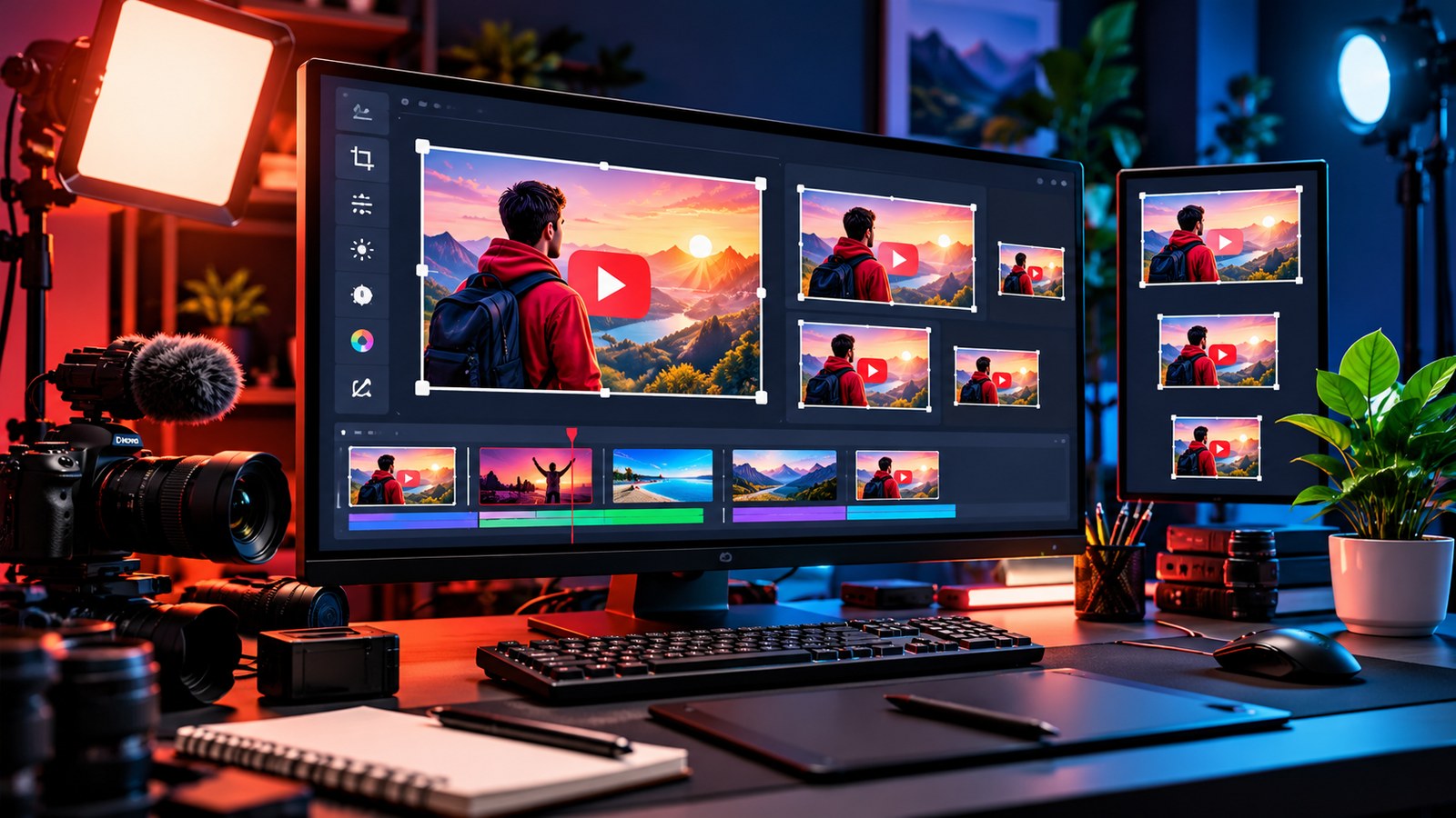
A thumbnail may look impressive in a full-size design editor and still become hard to understand when it appears in a small row of video recommendations. The solution is not to add more arrows, more text or more effects. It is to decide what a viewer should understand first, then remove anything that competes with that idea.
Use the following checklist before publishing a new video or refreshing an older thumbnail.
1. Choose one visual idea
Ask what the video is mainly about. A tutorial might show the finished result. A review might show the product in context. A travel video might focus on one recognisable place. One strong image is usually easier to process than a collage of five unrelated scenes.
The thumbnail should complement the title rather than repeat it word for word. If the title explains the specific lesson, the image can show the outcome or key object. Together they should create a clear expectation, not a puzzle that misleads people.
2. Test it at the size viewers will see
Zoom the thumbnail out or place it beside several other thumbnails. Can you identify the subject quickly? Can you read the few words you included? Does the focal point still stand out when the image is small?
This is where thumbnail tools can help. YTPlayTime lists thumbnail preview and size utilities among its creator tools. A preview is not a substitute for audience data, but it can reveal a crowded layout before you publish.
3. Use contrast to guide attention
The main subject should separate clearly from the background. Contrast can come from light and dark values, colour, shape or an uncluttered area around the subject. It does not require neon outlines around everything.
A useful test is to view the image in grayscale or squint slightly. If the subject disappears into the background, increase separation or simplify the composition. Keep the background relevant, but do not let decorative details become the primary focus.
4. Keep text short and readable
Thumbnail text is optional. When it genuinely adds context, keep it to a few words and choose a font that remains legible at small sizes. Avoid placing important text near the edges, where different displays or crops may make it harder to see.
Do not attempt to fit the whole title inside the thumbnail. The title already has its own place. Use the image to deliver the visual part of the promise.
5. Be honest about what the video contains
A strong thumbnail creates interest without promising an event, result or product that does not appear in the video. If you use a reaction, before-and-after comparison or dramatic image, make sure it represents the actual content. Misleading packaging may win a click and lose the viewer's trust immediately.
This matters more than a clever visual trick. A good thumbnail attracts people who are likely to be satisfied by what they watch.
6. Export the right file and check the upload
YouTube's official custom thumbnail help page provides current upload requirements and recommendations. For standard videos, it recommends a 16:9 aspect ratio and a high-resolution image; consult the help page for the latest size, format and account requirements.
Keep a master design file so you can make changes later. Export a final image in an accepted format, upload it in YouTube Studio and inspect the actual result after saving. A file that looks right in the editor can still have a crop, compression or colour issue after upload.
7. Compare versions with a clear question
If you are testing different thumbnail approaches, change one important element at a time where practical. For example, compare a close-up subject with a wide scene, or a text-free image with one short label. Do not assume a difference in views proves the thumbnail was responsible; traffic sources, title, topic and timing may also change.
Review performance in context and give changes enough time to produce useful data. When the evidence is limited, treat it as a hypothesis rather than a universal rule.
Before you publish
- One clear subject or idea.
- Strong contrast at small sizes.
- Text is optional, brief and readable.
- Image matches the actual video.
- Correct aspect ratio and file format.
- Final upload checked on desktop and mobile.
A thumbnail does not need to shout. It needs to communicate. Make the subject clear, let the title supply the detail and give viewers an honest reason to click.